Logos are perhaps the most important aspect of your brand, after the company name. 75% of people recognize a brand by its logo first, with colors coming in at a distant second. As a result, it’s crucial to take a good amount of time to consider what type of logo you want to represent your business. Discover the different types of logos that exist today!
Types of Logos
When it comes to types of logos, the sky is the limit. It’s essential to choose wisely. A good logo should make its mark on society and be easily recognizable. There are two types of logos. Name-based and image-based logos. It’s fundamentally up to you as the brand owner to decide which will be best for your company before you hire a logo expert or use a template, depending on your resources.
Name-Based Logos
Name-based logos such as wordmark or lettermark varieties are highly effective ways to represent your brand design. The guidelines on these types of logos are clear: use the brand’s name to create a great visual with killer typography. The result can be simple, ornate, unique, and everything in between.
Wordmark Logos
One popular type of logo is the wordmark or logotype. This is perhaps the simplest but also most complex way to go. Why? Because it consists of the company name written in a specific font. It’s possible to create a custom typography for the project. Or use a preexisting one. Most modern logotypes elect a sleek and simple font, but trend-focused companies might select a more elaborate one. The wordmark is best to use when your brand has a memorable name, such as ‘Coca-Cola’ or ‘Toys ‘R Us’.
Letterform Logos
Letterform logos are used regularly, particularly in the digital world. They consist of a single letter (usually the first letter of the company name) in a specific color and typography. Some examples might include Google, Netflix, or Facebook, among many others. When used properly, these logos are perhaps the most guided, dynamic, and dramatic designs. To pull this type of logo off the company must already be established. Otherwise, it may be unrecognizable and therefore defeat the purpose. They are great to use if a brand is about designing a minimalist lifestyle.
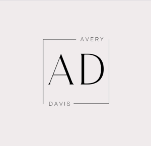
Lettermark Logos
Lettermark or monogram logos are great when your company or brand name is surprisingly long. Made from a brand’s initials and using specific letters and typography. They can be very dynamic. NASA makes an excellent example of the successful use of the monogram logo since its full name is five words long. Other memorable lettermark logos include BevMo and HBO. A font that properly conveys a brand’s identity is crucial here. For instance, choosing a flowy cursive typography for a new motorcycle company would not be ideal. There are many factors when choosing lettermark logos, such as spacing between letters, thickness, and font style. In this case, the company’s target audience comes into play, as it’s vital to consider whether an abbreviated version of the brand name will be appropriate and beneficial.
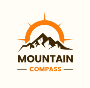
Picture Based Logos
A picture-based logo is a great way to create a strong impact on your brand identity. They can be used for all kinds of establishments, from designer clothing companies to small brick-and-mortar businesses. If the company name is long or tricky to remember, an image logo will be useful.
Logo Symbols
Logo symbols are a trendy way to go if you’re designing a new brand identity. These will often represent a real-world object, such as a plant or a kitchen knife. If you choose to go with a pictorial mark, there are several things to consider, such as whether you would like a literal representation of the brand, such as Apple or Shell.
There is also a lot of symbolism to be seen in a brand. For example, Twitter’s bird is facing up in the search for freedom of speech. To effectively utilize logo symbols, your brand should be fairly established so that your pictorial element can communicate what you do to your audience. Also, you must only do one thing to have a successful logo symbol, such as YouTube’s play button which hints at the videos. Be aware that if you want to branch out your offerings your logo might lose relevance.
Abstract Logo Marks
An abstract logo is different from a logo symbol because the designs are not a real-world interpretation. Instead, this tailor-made mark will define only your company and nothing else. Since it will be a unique logo. The idea in the case is to express something specific about the brand, for instance, the thought behind its creation or the target audience. A good example of this might be the Nike logo. Its abstract shape illustrates speed without it being literal. This type of logo is useful if your brand creates multiple things, such as a bank or a travel website. It’s best to go for a simple shape rather than a complex one to implement the emblem into future customers’ memories more easily. On that same note, keeping details and symbols to a minimum and focusing on a strong shape is the key to a successful abstract logo.
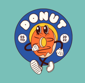
Mascots
Unlike an abstract logo mark, a mascot logo design embodies many different examples of the previously mentioned types of logos. A mascot logo creates a feeling of familiarity with the brand and makes it more memorable. It will essentially become the spokesperson. So much of the company’s marketing will revolve around the mascot.
Children relate particularly well to mascot logos, hence why most types of breakfast cereal have one. It is an especially successful logo to choose from if you are selling food, as is shown by countless companies such as KFC and Pringles. Another example of when to use mascot designs is when you are selling something complex and want to make it accessible. For instance, Mailchimp’s platform adopts the shape of a monkey as its mascot. However, be aware that mascot logos should not be used if you are selling a product that isn’t child-friendly, such as alcohol or cigarettes.
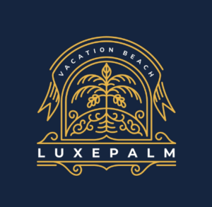
Emblems
Emblems are essentially crests that are used as logos. These logos have quite a traditional feel to them and have often been used to represent universities or, going back even further, monarchies. They are rather memorable and give the feeling that these brands have been around since the beginning of time. Furthermore, a good emblem logo will provide a sensation of professionalism and tradition associated with your company and provide quite a bit of creative freedom since there are symbols, images, and typography to consider.
Brands such as Stella Artois or Starbucks chose emblems as their logos for that exact reason: they aren’t going anywhere. Be wary of one aspect of emblem logos-they are often quite intricate, which will not work well on a smaller scale, such as a business card, since it will look blurred and illegible. One way to get around this is by selecting high-contrast colors and thick lines. Another effective method of getting around a potentially low-quality visual is to create a simpler logo that still contains the characteristics of the emblem for when you need your logo on a small scale.
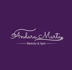
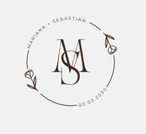
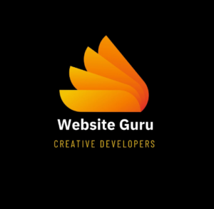
Combination Marks
A combination mark, as the name suggests, mixes an image with words. It could be that a company chooses to combine an image and some text, or perhaps even a mascot and letters. It could be that a brand has a logo that takes the form of a combination mark and then uses the elements separately depending on the context. For example, brands like Lacoste might use a combination logo on their website, but most of their clothing only boasts the crocodile.
Combination logos are great if your company is starting since you are helping your target audience find you by providing both shape and text. Providing that key to brand recognition is crucial to succeeding. Be wary of getting too complicated or busy with a combination mark. Instead, stick with a clean design for the best results. With time, you will even be able to stop using one of the elements to favor the image or the typography. For example, Mastercard rarely uses the text in their combination logo anymore, instead favoring their trademark shapes and minimalist design.
Dynamic Marks
Dynamic marks are perhaps the most curious variety of logos, functioning as such: they will have a basic logo to stick to while modifying components as needed. A great example is the Google logo that changes based on holidays or times of year, like adding winter lights during December. These regular changes keep people engaged in the brand and create a sensation of creativity and forward thinking. Other examples of dynamic logos include Nickelodeon and Virgin. These types of logos are beneficial if your brand is part of a creative industry, such as music labels or fashion brands. Just be sure not to change huge elements of the logo each time so that it remains recognizable. Otherwise, your followers might get lost in all the variations.
Refreshing Your Logo
Sometimes, the time comes when you need to refresh your logo. There are many reasons behind this. For example, your current logo contains graphic elements that are out of fashion, such as a passé font or unpopular color. There is not necessarily anything wrong with the logo itself. It just no longer suits your company goals.
Another reason why you might need a new logo is that you didn’t have great financial resources when you made the current one. Perhaps you just used a template, even. But now, your company is thriving, and you can more than afford the best new logo. This might even be a reason to celebrate with your team.
It’s important to make the right kind of decision when you’re refreshing your logo. Indeed, one of the most important aspects is being able to design a logo that will fit anywhere and that easily be identified from a distance or in a small format. People say that if your logo is identifiable on a dime coin, it is a successful one. Similarly, the logo should look good on digital media, such as your Instagram posts, but also on a business card or coffee mugs.
If you have the resources for it, one idea is to have multiple graphic designers working on revamping your logo. This is because each person has their viewpoint on aesthetics, and so you will be able to choose the logo that is closest to your guidelines. If you have received several options from your designers and still can’t decide, there’s always the possibility of creating a poll on an Instagram story or simply asking trustworthy friends what they think of the designs.
How ComeUp Can Help with Your Logo
ComeUp is no stranger to logos, having gone through a major change ourselves. We went from being called 5euros and having a letterform logo with the number five to switching to ComeUp, this time opting for a monogram logo. The platform is full of incredibly talented graphic designers who are more than happy to create all types of logos for your business, regardless of whether you are a one-man brand or a big corporation.
If your logo needs a little revamping, perhaps try searching for people providing service modification. This is useful if you simply need a color change, for example, or maybe a guide on how to revamp your logo. Sometimes, a logo was created so long ago that it’s pixelated by today’s high standards, so it needs to be vectorized. Vectorization also provides a logo file that will not pixelate no matter how much the image is resized, which is incredibly useful when creating mockups.